
TNSETC - UI/UX Revamp
Industry
Travel
Contribution
UI/UX Design
Duration
2 - 3 Weeks
Platform
Mobile App
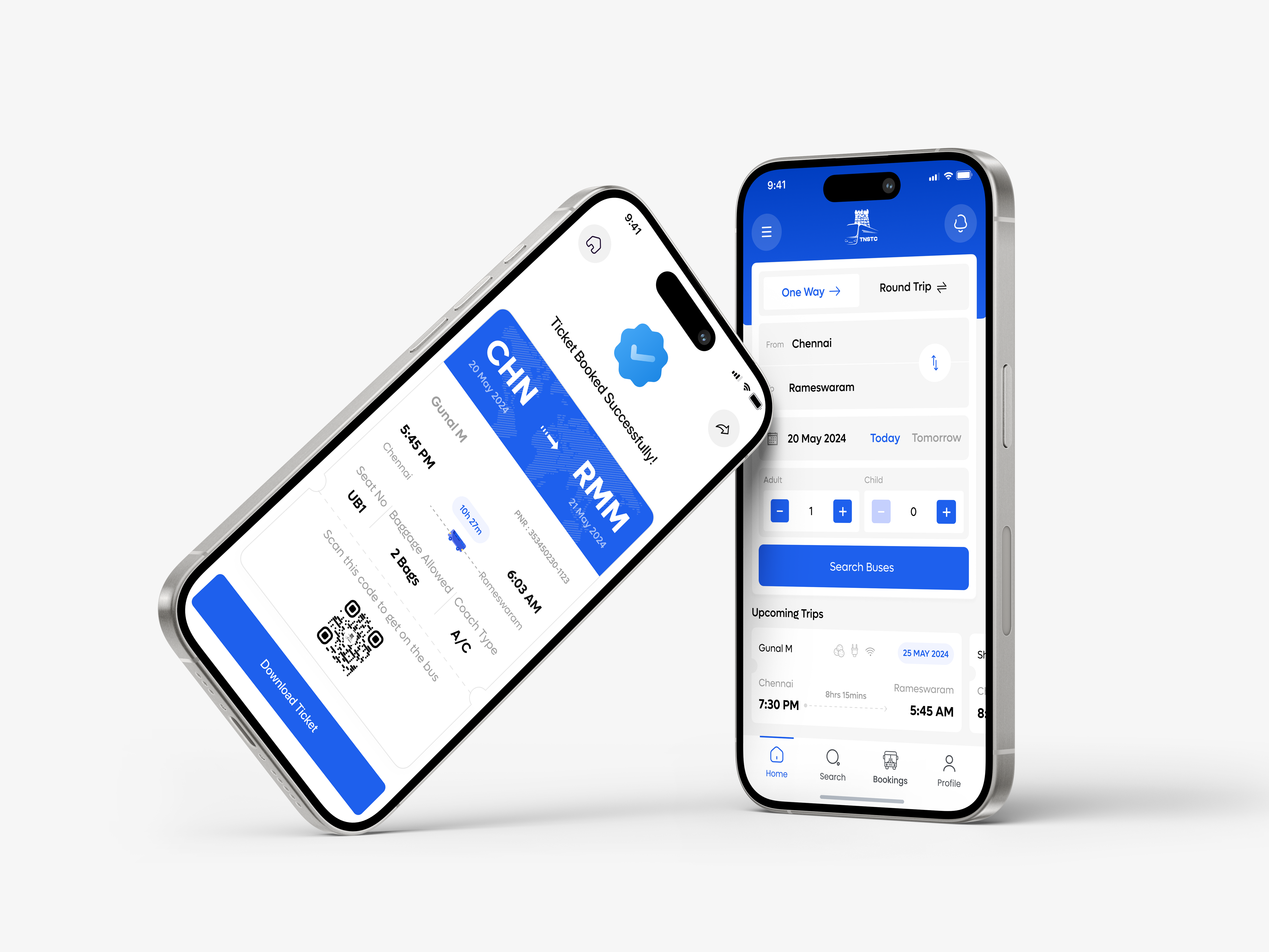
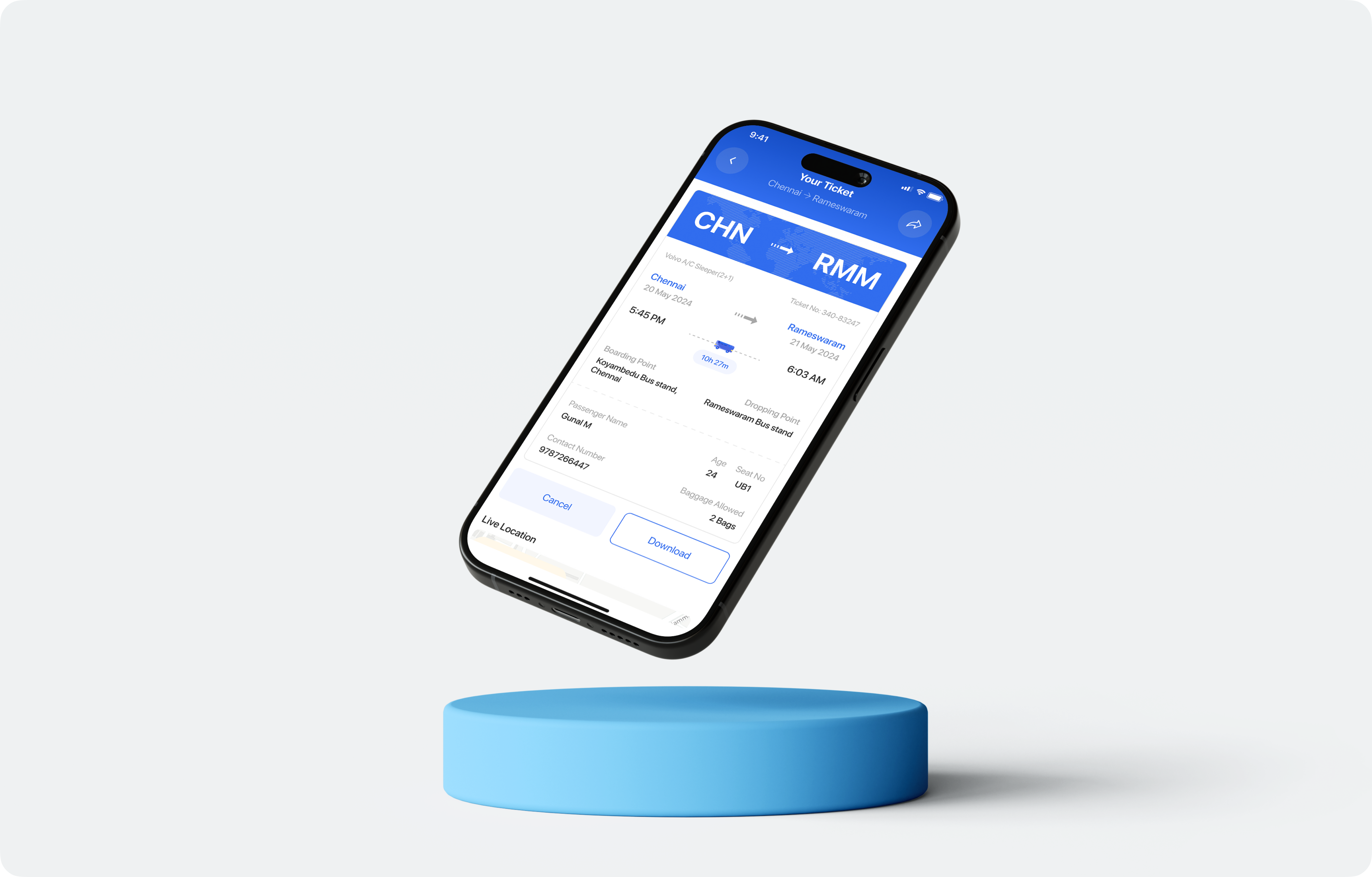
Redesigned the TNSTC App for Seamless Travel
The TNSETC mobile app was designed to streamline the experience of booking government buses across Tamil Nadu. This project focuses on solving key usability issues and creating a user-friendly interface that empowers travelers with a frictionless journey planning process.
With the redesigned app, users can:
- Seamless login and onboarding to reduce entry barriers
- Smart matching based on skill preferences and availability
- A streamlined request flow to propose or accept barters in just a few taps
- Lightweight profiles that focus on skills, not resumes
Challenges
The existing TNSTC app suffers from an outdated and inconsistent user interface that makes navigation difficult, especially for first-time users and non-tech-savvy individuals. The booking process is overly complicated, with multiple unclear steps, technical jargon, and poor visual hierarchy. This leads to confusion, increased drop-off rates, and a lack of trust in digital ticketing.
Key pain points included:
- Cluttered screens with low visual clarity
- No clear guidance through the booking flow
- Redundant form fields and unclear error messages
- Lack of feedback after actions like seat selection or payment
The Solution
The TNSTC app was redesigned with a focus on simplicity, clarity, and accessibility. The navigation was restructured for ease, and the booking process was streamlined into just a few guided steps. A modern UI with improved readability, bilingual support (Tamil & English), and larger touch targets ensured inclusivity across user groups. Continuous feedback collection was also integrated to support ongoing UX improvements.
A Small Ask, A Big Impact
I had a little bit Scope of Work from TNSTC. It was quite a normal assignment with a few diffs
Redraw the Interface
- App
- Typography & Colors
Reconstructing the interface
- Userflow
- Mobile App
User Examine
- Survey
- Interviewing
- Problem & Solution
- User Insights
Project Timeline
At every stage of creating the app, I will try to make it’s User Experience user friendly as possible

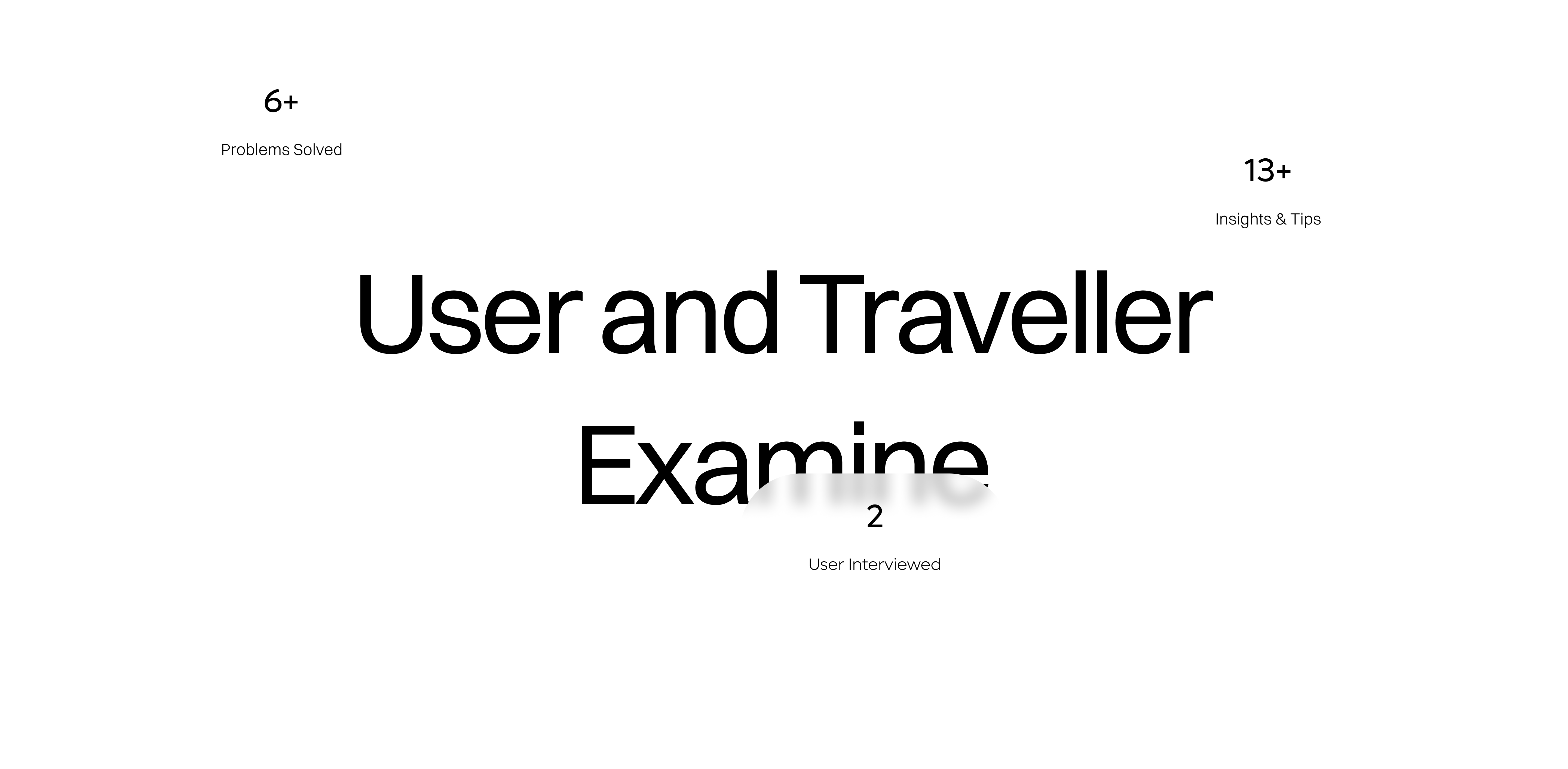
User Examine
I got some insights from users who took part in making clearing on defining cons


User Interview
I have set up User Interview , which was part of our mission and important tip for design

Quantitative Analysis
I have done with User Survey and it helped me a lot, as I have really cool ongoing insights

Secondary Research
I have took up some valuable user review form Google Playstore, there I got lot of valuable isights too!

Planning
I have Come up with these Solutions and are pretty proud of these

Design Code
I Worked hard on Design Code for TNSTC to give brand new look of incredible & powerful